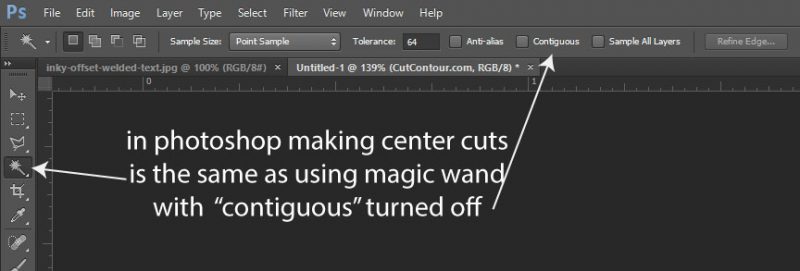
Making center cuts means removing the background even when it’s inside an object. In Photoshop you can select your background alone or all background everywhere. This is known as contiguous versus non-contiguous selection.

This can either turn out really well for you or really poorly depending on the original intent of the artwork. It can turn out especially poorly if your source file is a JPG which lacks transparency data, meaning that white can be both background or content and it’s hard to say which. Let’s look at some good and bad examples:

In the image above I have a transparent background, most likely a PNG, and I’ve selected the background with contiguous turned off, which will cause for the center of the letter “O” to be selected. This is definitely what I want to happen, the alternative is shown below:

I’ve added a background color to help illustrate our problem here. With contiguous turned on we’ve now lost our center cutouts and our letter “O”‘s will not get removed.
When you have a professionally made file with well defined transparent regions the answer is obvious that you almost always want center cuts and to remove the entire background. Plus…don’t forget if there are a few small areas you don’t want to remove you can always just remove those cut outs from the file when you’re done.
So now let’s look at the area where center cut-outs are most likely to cause an issue. Rather than a nice clean PNG suppose we have a JPG, it’s the only thing the client has, and it’s mixed white background and content:

Here you can see we’ve selected the white background, non-contiguous selection, to create center cuts. Our letterring is great but our friend inky is now missing his eyes and a bit of his brain. There are two solutions to this, one is to run the file like this and then remove the paths we don’t want in illustrator. The other is to add some path offset until the internal selections close up and the text body welds together:

By expanding our selection and creating a 1/8th inch offset we now have a file that’s a lot easier to cut and most of the unwanted cutouts have vanished. We still have to remove one path between the logo and text but this is a lot closer than before.
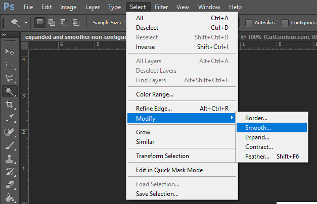
If that sounds like too much work then one option is to not only expand our selection 1/8th inch but also to smooth our selection.

Expanding and smoothing will give results as below. I personally think it lacks a lot of the character of the previous example but it will definitely be easy to weed. Given my choices of a bit of touch up work or a lumpy potato shape I would choose some manual retouch.

The cut contour program does not currently offer smoothing but you can do this in photoshop easy enough.
Thanks for reading this article and please go give my program a try and as always I’d love some feedback.